For my first visualization of the CitiBike system data, I chose to focus on mapping out the path of an individual bike in the CitiBike system using data from May 2014. Jiwon, Billy and I met earlier in the week to review the available data and revise our midterm proposal for our analysis of CitiBike. We think it might be possible (although very difficult and not particularly scientific) that by following the path of a bike through the CitiBike system, we can figure out when a station has been refilled or is depleted of bikes. Each bike trip has a start and end station, and if the start station of the next trip doesn’t match the end station of the previous trip, then in theory, the bike was taken out of the system either for a) repair or b) to refill another station.
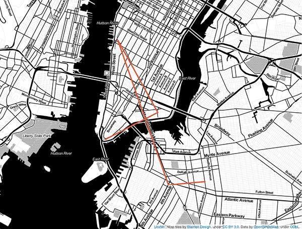
This is the path of one bike which visited a few stations before being removed from the system:

My visualization is pretty strange given I am drawing a line to connect the stations the bike started and ended at. I do not have data about the actual street route the bike took. It might be better to just draw a circle for each station the bike visited and a different color for the start and end stations rather than draw a line. However, this map does show that this bike was used a few times before being taken out of the system and moved elsewhere.
This second map shows the second path of the bike from station to station. It is much more chaotic as the bike was in the system for quite some time before being taken out of the system again.

I used Leaflet, D3 and Stamen Map tiles to create this visualization using CitiBike System Data from May 2014.
I took a small sample of the data to create my map and manually created a LineString GeoJSON file of the bike route coordinates. I modified this example using D3 and Leaflet together by adding in my own data and using Leaflet and Stamen map tiles. View my code here.
Some Helpful Resources for Understanding Web Maps:
Mapping Intro
MapTime Website
Mapbox – How do web maps work?
Mapbox Glossary
If we are able to use this approach to analyze how well CitiBike is rebalancing the system, then I think a mapping visualization might not be the best end visualization for the data.
********
Wind Map is one of my favorite online data visualizations. It’s really interesting to see wind patterns and speed mapped out across the entire United States. This wouldn’t be a great map to refer to if you needed to actually know data about wind speed in a particular location but is great for an overall picture of the flow of air across the United States. This is definitely more of an artistic representation of geographic data then a scientific representation. The user interaction is pretty limited. You can zoom in a few levels, but there isn’t much more you can learn from the visualization by zooming in. More of a pretty big-picture representation of data.

