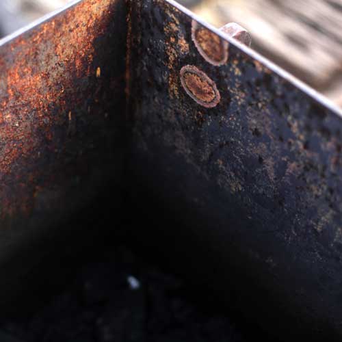
I took a tour of the closed section of the High Line today, and would like to do something visually with these colors, and textures.

Is it possible to make something that is computer generated feel more weathered, worn, human, and natural?
Later today, I met with Meg to chat all-things-data-visualization. Most of the visualizations we reviewed looked very slick and futuristic.

But I really love the way metal such as steel oxidizes, rusts, and the way paint is weathered away.
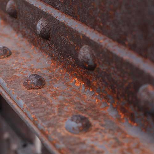 These are the things I noticed when I am walking around New York City. It would be great to take this visual love of the process of weathering/wind/oxidization as my inspiration for the data visualization of my Quantified Self project.
As I was chatting with Meg, I realized that it is tough to think of what the visualization will be without the actual data in hand. Ultimately, I want to show what my behavior is over time and at what point headaches crop up. Then I want show the triggers at play associated with my headaches.
I am picturing something that ultimately combines “sexy abstract map” with an ability to drill down to more details to a pleasing “infographic/dashboard.” I will probably show the data as it plays out over time (the course of a week) rather than geographically based. However, I do like the idea of using more natural colors and texture somehow although maybe it won’t work visually.
It seems important with data visualizations to know in advance the story you want to tell! And the story should inform the choice in visuals. I love simple ways of showing a visualization by the use of color, lines, shapes, and circles. Here’s another sexy abstract map that visually makes me think of headaches.
